
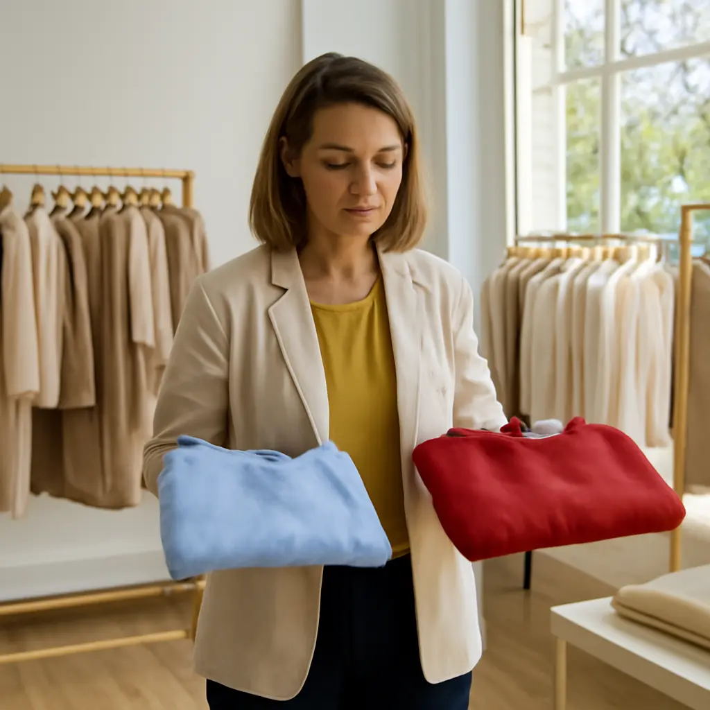
Color Choices and Youthful Style: Unexpected Shades That Brighten Women’s Looks This Season
Clothing color is the hue and value of a garment, and it can change how an outfit frames the face, contrasts with skin, and communicates a mood. This season, shades beyond the familiar “youthful” pastels—especially butter yellow, soft blue, cherry red, and fresh green—offer wearable ways to make an outfit feel brighter and more current. No color can reliably make someone look younger, and effects depend on lighting, fit, personal coloring, and preference; however, color research and practical styling guidance explain why a well-chosen shade can bring visual freshness. The sections below distinguish seasonal trend reporting from evidence, explain how color interacts with complexion and contrast, and offer ways to test unexpected hues without replacing a whole wardrobe.
Color Choices Shape a Youthful-Looking Outfit
A youthful-looking color choice is not a scientifically defined beauty category. In practical styling, it means selecting a shade that gives an outfit a lively, harmonious appearance and draws attention toward the face. The Color Association of the United States describes color forecasting as a way of identifying palettes likely to resonate with consumers and designers; it is a trend tool, not evidence that any hue changes a person’s age or skin.
That distinction matters: seasonal color coverage can show what is appearing in fashion, while claims about flattering effects are best treated as individual styling judgments. The Pantone Color Institute’s fashion trend reports, for example, identify colors seen in runway collections and broader design directions. Runway visibility indicates a trend, not a universal rule about who should wear it.
Why color can change an outfit’s impression
Color influences perception through hue, lightness, saturation, and contrast. A light, clear shade can make an outfit read as airy; a saturated color can feel energetic; and a low-contrast combination may look softer than sharp black-and-white pairing. These are visual effects, not age measurements. A person’s complexion, hair, eye color, garment placement, and the lighting in which an outfit is seen all affect the result.
The Commission Internationale de l’Éclairage (CIE) defines color appearance in relation to the viewing conditions and the observer, underscoring why a shade can look different from a store display to daylight. A useful real-world test is to hold a garment near the face by a window and check whether the overall combination looks balanced to you—not whether it follows a rigid seasonal-color rule.
Trend evidence versus age claims
Fashion trend reports can validate that a shade is appearing in collections, but they do not prove that it makes women look younger. There is no broadly accepted clinical metric for “years younger” caused by clothing color. Treat the phrase as shorthand for a fresh, bright, or modern styling effect, and prioritize comfort and personal taste over promises of anti-aging results.
Unexpected Seasonal Shades Add Brightness
The most useful unexpected shades are often familiar colors in softer, warmer, or more vivid versions. Butter yellow, powder and sky blue, cherry red, and lively green can each offer a different kind of visual lift. Their appeal lies in versatility: they can be worn near the face, used as a small accessory accent, or balanced with neutrals.
Butter yellow: a warm alternative to cream
Butter yellow is a pale, warm yellow that sits between ivory and brighter lemon. As a top, scarf, or cardigan, it can introduce light without the starkness of pure white. People who find yellow difficult to wear can try it farther from the face—in a skirt, bag, or shoe—or choose a muted version and pair it with denim, navy, or brown.
A practical example is a butter-yellow blouse under a neutral jacket: the color becomes a controlled accent rather than the entire outfit. The effect depends on the specific shade and surrounding colors, so compare it in natural light before deciding whether it suits your wardrobe.
Soft blue: a cool, easy-to-pair refresh
Soft blue includes powder, mist, and pale sky-blue hues. It works as a low-intensity alternative to crisp white and can pair with denim, gray, navy, or tan. A blue shirt or lightweight knit near the face may make an outfit feel calmer and less severe than a high-contrast combination, though the impression varies with fabric, fit, and lighting.
For a simple test, compare a soft-blue top with a familiar neutral in the same cut. This keeps the garment shape constant and makes it easier to judge whether the color—not a different neckline or fabric—is what you prefer.
Cherry red: a small dose of saturation
Cherry red is a clear, saturated red that creates a stronger focal point than a muted rose or burgundy. It can add energy in a blouse, lipstick, belt, or handbag. Because it attracts attention, using it in one element at a time can make it easier to wear and prevent the shade from overwhelming an outfit.
Red is also a useful example of why context matters: a cool blue-red and a warmer tomato-red can look quite different beside the same complexion. Rather than relying on a universal “best red,” compare alternatives in daylight and consider whether you like the balance with your usual makeup and accessories.
Fresh green: from sage to vivid chartreuse
Green spans a wide range, from subdued sage and mint to bright chartreuse. Sage offers a quiet alternative to gray or beige, while a more vivid green can act as a statement accent. A green scarf, knit, or accessory is a low-commitment way to try the trend; a larger garment makes more sense once you know which undertone and intensity you enjoy.
These shades are not interchangeable: pale green can read gentle, while high-saturation green is more visually assertive. The best choice depends on the role the garment plays and the level of contrast you want.
How to Choose and Wear the Shades
A shade becomes useful when it fits into real outfits. Instead of treating trend colors as a shopping checklist, test them against existing clothes, preferred silhouettes, and everyday settings. This approach keeps seasonal experimentation practical and avoids confusing novelty with a need to replace clothing.
Use placement and contrast deliberately
Garments worn near the face have the most direct effect on the overall color balance, while trousers, skirts, shoes, and bags let you try a shade with less emphasis. Pairing a vivid color with a neutral can control contrast; combining several saturated shades creates a bolder look. Neither approach is inherently more flattering—the goal is a combination that feels intentional.
- Try a new color in a scarf or top before investing in a full outfit.
- Check the shade in daylight as well as indoor lighting.
- Compare similar garments so fit and fabric do not distort your color judgment.
- Build combinations from colors already in your wardrobe, such as blue with denim or yellow with navy.
Consider fabric, fit, and lighting
The same hue can look different on matte cotton, glossy satin, textured knit, or sheer fabric because surface and light affect its appearance. Fit also matters: a well-proportioned garment in a quieter shade may look more polished than an uncomfortable or poorly fitting item in a trending color. When possible, assess the complete outfit rather than judging a swatch alone.
A simple at-home color comparison
Use a short comparison rather than a strict color-season quiz. Stand near a window, wear a neutral base, and place two candidate colors near your face in turn. Notice which one you prefer and whether it works with your existing wardrobe. Repeat under the lighting where you usually spend time, since color appearance changes with viewing conditions, as the CIE’s color science explains.
Conclusion: Choose Color for Freshness, Not an Age Promise
Butter yellow, soft blue, cherry red, and fresh green are unexpected seasonal shades that can make outfits feel brighter and more current. Color’s impact depends on contrast, light, fabric, placement, and individual preference; trend reports identify fashion directions but do not establish that a shade makes someone younger. Start with a small accent, compare colors in realistic lighting, and choose the combinations that make you feel comfortable and confident. For further context, consult seasonal color reports from the Pantone Color Institute and the Color Association of the United States, while treating styling advice as personal experimentation rather than a guaranteed result.
Sources: Pantone Color Institute, Fashion Color Trend Reports, https://www.pantone.com/articles/fashion-color-trend-report; Color Association of the United States, Color Forecasting, https://www.colorassociation.com/; Commission Internationale de l’Éclairage, CIE 15:2018 Colorimetry, 4th Edition, https://cie.co.at/publications/colorimetry-4th-edition.